
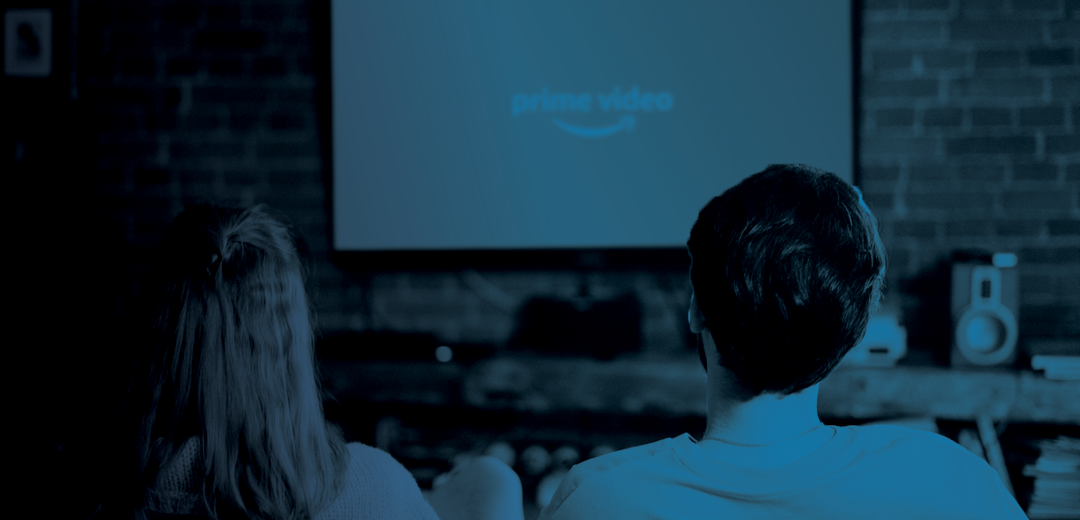
Prime Video Case Study
Assessing and improving the discovery and selection phases of Prime Video’s customer streaming journey.
Role
This project was for a User Experience Certification course in which I was the sole UX and UI designer.
Timeframe
Completed during an 6 week mentorship course.
Tools
Axure, Figma, Zoom, Google Slides, Mural, Adobe InDesign and Illustrator.
Define the Challenge
Prime Video is an over-the-top streaming service with over 200 million users. And yet, after interviewing a few of them, I discovered it is often one of the last stops for streaming. Most users said they became a customer of Prime Video by default rather than as a primary choice after they signed up for Amazon Prime. For this project, I was tasked to find out where customers pain points lie in the discovery and evaluation phases within Prime Video, and how we might make the experience more efficient and delightful for users.
OKR’s
Reduce number of clicks and time spent in discovery phase
Low engagement browsing: Time spent in discovery phase decreased.
Watch together: Time spent in discovery phase decreased.
Reduce drop off rates for customers switching services
Watch something within a category: Early results indicate reduced drop off rates in discovery phase
Problem Statements
1
As an exhausted businessperson, I need to discover shows that help me quickly decompress and spend time with my partner or family so I can unwind and enjoy my daily leisure time.
2
As a trendspotter, I need to discover shows that drive the cultural conversation, so I don’t feel left out in social circles.
Empathize through research
In-depth interviews
Interviews were conducted based off of an interview guide with five streaming platform customers. Results were compiled in an affinity map and rainbow spreadsheet and synthesized with empathy map, root cause analysis and 5 why’s to produce insights and arrive at the problem statements.
4/5
Habitual Streaming
Users watch streaming services together with their spouse, roommate, or significant other, habitually in the evenings after work.
4/5
Decision Fatigue
Mentioned being frustrated or overwhelmed with the amount of choices available to them in streaming services.
4/5
Many distractions
Users are disengaged while watching streaming services, and often accomplish other tasks while they stream.
5/5
Cultural conversation
Users said they decide what to watch based on what’s part of the current cultural conversation and find recommendations online and from friends.

“It feels like there’s too much information to make a decision and you just want it narrowed down somewhere.”
-Zach, 34, Phoenix
Personas

Andy Pajamazon, 34, Married with kid
Exhausted husband and dad
His goal:
To quickly browse for something he and his wife can agree on.
His frustrations:
Sensory overload taking in visual information when choosing something to watch.
Trouble finding something that suits both he and his wife’s interests.

Maria Mainstream, 29, Partner, No kids
Social remote worker
Her goals:
To quickly get to a familiar show as background noise while she’s disengaged.
To stay up to date on the latest cultural conversations regarding TV and movies.
Her frustrations:
A landing page that is filled with shows she’s already seen or is never going to watch.
Trending content slowing her access to background noise during times of low engagement.
Journey maps
Andy’s Journey

Maria’s Journey

Ideate Strategy & Solutions
1. How might we speed up the browsing experience for pairs or groups so they can quickly decompress together?
2. How might we curate shows offered based on the level of engagement?
Recommendations
Add more robust filtering options
Help partners with different interests who watch together find something that works for both of them.
Watch something within a category
Expanding on the idea of watch something feature by applying it within each specific genre, helping analysis paralysis.
Speed up selection with watch together
Explore watch together feature to decrease time spent in evaluation.
Engagement based on time of day
Improve browsing personlization by prioritizing content based on what time of day the user generally interacts with which type of content and how engaged the user usually is during that time of day.
Prototype, testing and iterations


Watch something within a category feature
Sketches and user flows were created with the goal of less clicks and less time spent to get from browsing to playing Andy and his wife’s final choice.
The watch something within a category feature helps Andy and his wife find something quick they can agree on, but with control over which category they want.
User testing insights: Users did not recognize the shuffle icon as the watch something feature.
Some users want more control over choices within the watch something feature.
Iteration: To iterate on the shuffle icon, I added a pop up to point out the new feature to customers. The pop up would occur the first 5 times the user opened the landing page after the feature was added, or until after the first time the user clicked on the shuffle icon. In the next round of testing, everyone successfully found the watch something feature and accurately explained its purpose.
Iteration: One user mentioned she likely wouldn’t use this feature because she wants control over what she watches. I iterated by more noticeably pointing out the value proposition of the feature.
What would be next: One customer brought up that they’d like the watch something feature to offer shows that are different than those offered on the landing page, because they’ve likely exhausted their landing page before using it. So next, I’d research content people want within watch something compared to content people want within their landing page. I’d also research when in the customer’s journey they may use the watch something feature.


Watch Together feature
Sketches and user flows were created with the goal of less clicks and less time spent to get from browsing to playing Andy and his wife’s final choice.
The idea is that customers could choose a watch together mode in which they’re taken to a shared landing page with content curated to fit a combination of two profiles within one household who habitually watch together.
User testing insights: Although I explored adding a ‘what is this’ button with a pop up explaining the new feature when clicked, I still found that users thought watch together was similar to watch party, in which users in separate households could watch together remotely.
Users did not readily notice the difference between their watch together landing page and Andy’s individual landing page.
Multiple users said they’d enjoy this feature. They said they share their profile with their partner and would like it because it would get their partner’s content out of their feed.
Iteration: The name of the feature was changed from ‘watch together’ to ‘paired profile’ os users might differentiate the watch together feature from the watch party feature. In the next round of testing, everyone correctly described that paired profiles were for multiple people in one household so the name change appeared successful.
Iteration: To clarify the difference between their landing page and their paired profile landing page, a hero image was created and the paired profile icon was changed. Value proposition popups were also added to the top navigation and first paired category option.
What would be next: Some users didn’t choose the paired profile option when first prompted to pick something to watch with their spouse. Next I would research why users didn’t choose to use this feature and how we might better communicate what it is to customers seeing it for the first time.


Landing page based on engagement
Sketches and user flows were created with the goal of less clicks and less time spent to get from browsing to playing Maria’a final choice for disengaged viewing.
The idea is a landing page based on engagement depending on the time of day they’re viewing. Machine learning would help to know when the viewer is watching shows that are low vs. high engagement.
User testing insights: Users did not scroll past these first 4-5 low engagement categories before choosing a show, so browsing was sped up quite a bit for Maria’s flow.
One user asked if networks might be offended to find themselves in a category labeled ‘background noise’.
One stakeholder brought up that having the landing page change completely depending on the time of day without prompting might be jarring to viewers.
Iteration: Added value proposition to explain why their landing page is different than what they’ve come to expect.
What would be next: I would speak with content writers to see if there might be a better compromise in category names that convey low engagement while fostering partnership with networks.
Consider testing a toggle on/off for a low engagement mode that might be less jarring for customers and offer them more control.